First things first, I have no idea what I'm doing. I never had a blog, but I always thought they were cool, so I made this one to document my journey in this new direction I'm trying to take my life in - something unheard of and something that'll definitely benefit society ✨Trying to become a professional musician✨.
I know, I know, me and my crazy and smart ideas, lol.
I guess this blog might end up teaching you something (probably not. Let's be real, if you actually end up reading this blog, you'll likely unlearn stuff), like I said I have no idea of what I'm doing. This is the pinnacle of blind leading the blind!!!
But enough of all this yadda yadda chit-chat, let's get back on topic.
✨Branding✨
Well, we all need it. It's what sets us apart from our competition, or at least that's what people on the internet say (and one knows the internet is always correct). Well, I for one never really cared for it. I believe the music you make, the amount of gigs you play, the following you have/get, and the word of mouth you generate are way more valuable than how some stupid letters look on a screen or a t-shirt.
But hey, what do I know? ¯\_(ツ)_/¯ After all, I've just started this project.
But this doesn't mean you shouldn't have a logo for yourself. Did you ever watch American psycho? Well, I didn't, but I did watch that famous clip where they showed their business cards and how they were so proud of how they looked, felt, whatever (which is a VERY NORMAL AND NOT WEIRD AT ALL!!! =P).
I get them, I mean, who wouldn't want something with their name on it to look cool? I wanted something with my name on it that looked cool! D= .
Furthermore, I wanted something that looked nice and set me apart from the Helvetica/ Arial font nightmare. I also didn't want mine to look "professional" or "corporate". I wanted something distinctive, cute, playful, something that pleased my eyes, showed things I liked or in a way somehow showed my personality and above all, I wanted something that looked cool.
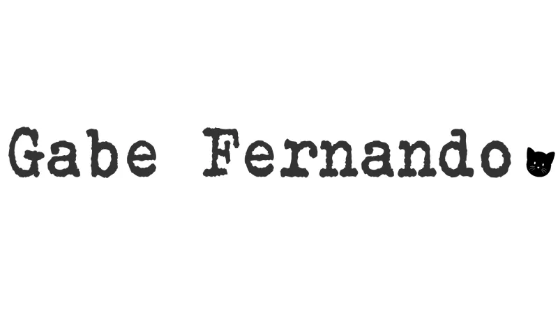
Below is the final product, prepare to be marvelled:

Ahh, simply amazing...
The contrast, the contours, the gravitational pull (iykyk), clearly a magnum opus and the 8th world wonder!
Nah, but for real, I just wanted something that looked nice. All in all, I reckon I spent about 30 minutes designing it. Found a picture of a cat online, bought the licence™ (quite cheap as well, only 8 dollaridoos, not bad at all).
So, what was my thought process when designing this?
Well, here's the thing, like I said, I don't believe logos are really that important for one's artistic identity. In my humble opinion, what you post on YouTube/SoundCloud/Instagram is way more valuable than how some letters will look on a screen, but that doesn't mean you shouldn't try to make something that resonates with you and that you like.
Most people simply write their names using Arial as the font and call it a day, and that's completely fine! I wanted something that showed who I was and what I liked.
My ideas were:
- Use a cool font (shocking, I know):
- There was always something about the look of text written with a typewriter that I liked; It's just so unique, and I felt it would be cool if my name looked like it was written using one.
- Using a symbol of something I love to add character and uniqueness:
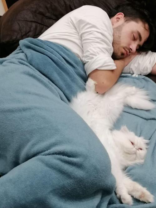
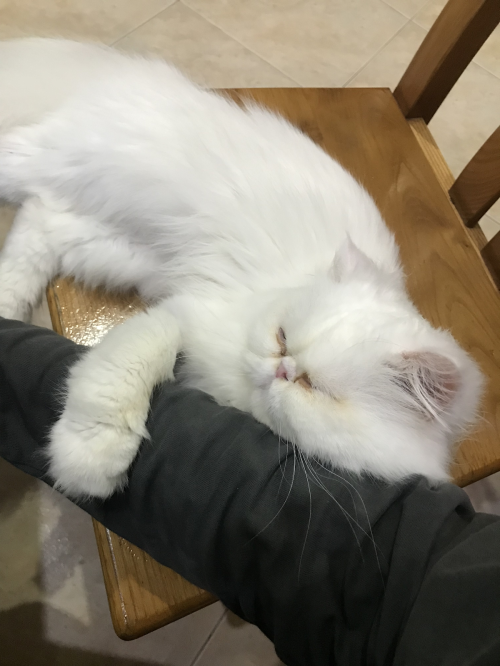
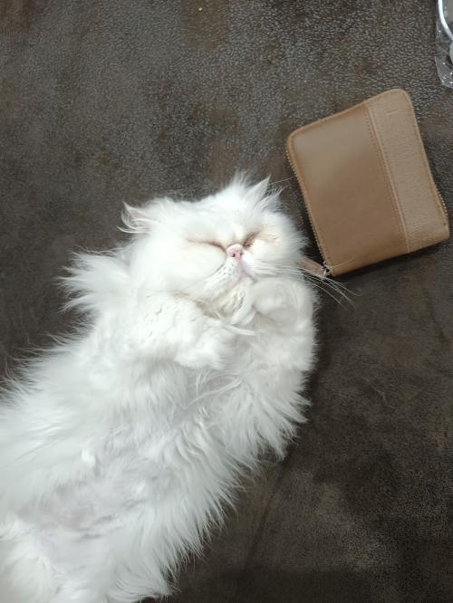
- I have always loved animals since I was a kid. And animals always loved me. So, using a symbol that represented an animal was clear from the start; The question was what animal to use? Actually, no, there wasn't a question, because there wasn't a need for one. Admittedly, I simply wanted to come off as smart and deliberate about how I deeply thought about my logo, trying to choose the best choice to make you go "Wow, Gabe really thought this through! OMG OMG HE'S SO COOL!!! :O", while in reality, I picked a cat face because of my cat Bella. I love her, she's really cute & sweet (she's also really smart!!!). So I wanted to make her part of my image. That's all!
There was only one problem: Where do I incorporate the Bella in my logo?
I thought the best course of action was not to make Bella the focal point, but just a small detail. So I decided to use her as a dot. Instead of having my logo be "Gabe Fernando." it'll be "Gabe Fernando[Insert face of the most beautiful cat ever, BELLA <3]".
Was this smart? Does it even make sense? I have no idea, but I like how it looks, and that's enough for me.
The point I tried to get across is that it really doesn't matter. You have way more important things to obsess on than making your logo perfect (whatever that means), innit?
It seems that nowadays we're stuck with this idea of everything having to be perfect, which is impossible, because we're human beings and we're inherently imperfect creatures. We're basically analogical robots; Everything we do is located in a spectrum, not zeros and ones.
There will always exist some sort of deviation from what one considers amazing. I've read people online say things like they're trying to be perfect/ master something before moving to the next objective. The reality is, if you do this, you won't go anywhere. Trust me, I know 'cause I was one of these people (and still am, it's hard because you want to strike a home run the first time you do something, when that's not how things work). You'll learn 100 times more from failure than you'll ever learn from success. Fearing failure is fearing success;
Even more so when trying to become an artist, one needs to realise that it will be uncomfortable in the beginning. We'll feel embarrassed doing the rounds, you know, going from pub to pub playing to crowds that honestly would rather not hear us play, as we have nothing to show for and the only thing to give us solace is that we love what we do. And as time goes on, I promise you we'll improve and be better equipped to handle these environments since we already put ourselves through that "pain".
So the moral of this post is to ask you to have fun and try not to be such a perfectionist in every little thing, take some things lightly. And do things because you like doing them, make shit because you like how it sounds or looks, and not because you think your future fans might or might not appreciate it.
The reality of the situation is the following: The chance of you becoming an Ed Sheeran or Taylor Swift in this industry is quite small, and a lot of things you do in the beginning won't matter to a lot of people. So why not have fun in this journey and actually love what you're doing instead of trying to appease someone who currently doesn't exist?
Make the logo you love, make the music you love, perform how you like. 'Cause believe me, when you get a following, they'll love it all, because it resonated with them the same way it resonated with you =D.
If today's your birthday, happy birthday!
And in case I don't see ya, good morning, good afternoon, good evening, and good night!
Love you all,
Gabe Fernando out
X
EDIT: Man, first of all, the amount of typos that existed throughout this post is wild. I'll never write anything under the influence of the drink ever again lol.
More importantly, I need to announce that Bella passed away a month after this post from a thrombosis. I don't currently want to delve into the details, but I'll write a post here on the anniversary of her passing. Bella to me wasn't a cat; She was a human, such a brilliant soul that left this world way too soon.
I lost my sidekick; she was always in the studio with me while writing and playing.
At the very least I can have solace knowing I gave her the best life I could give her, and she made my life the best she could make. I'll always love you Bella!
Thank you for making my life better! You'll forever be immortalised in the memories I have of you. You and I will always be back then
X